Background & Motivation
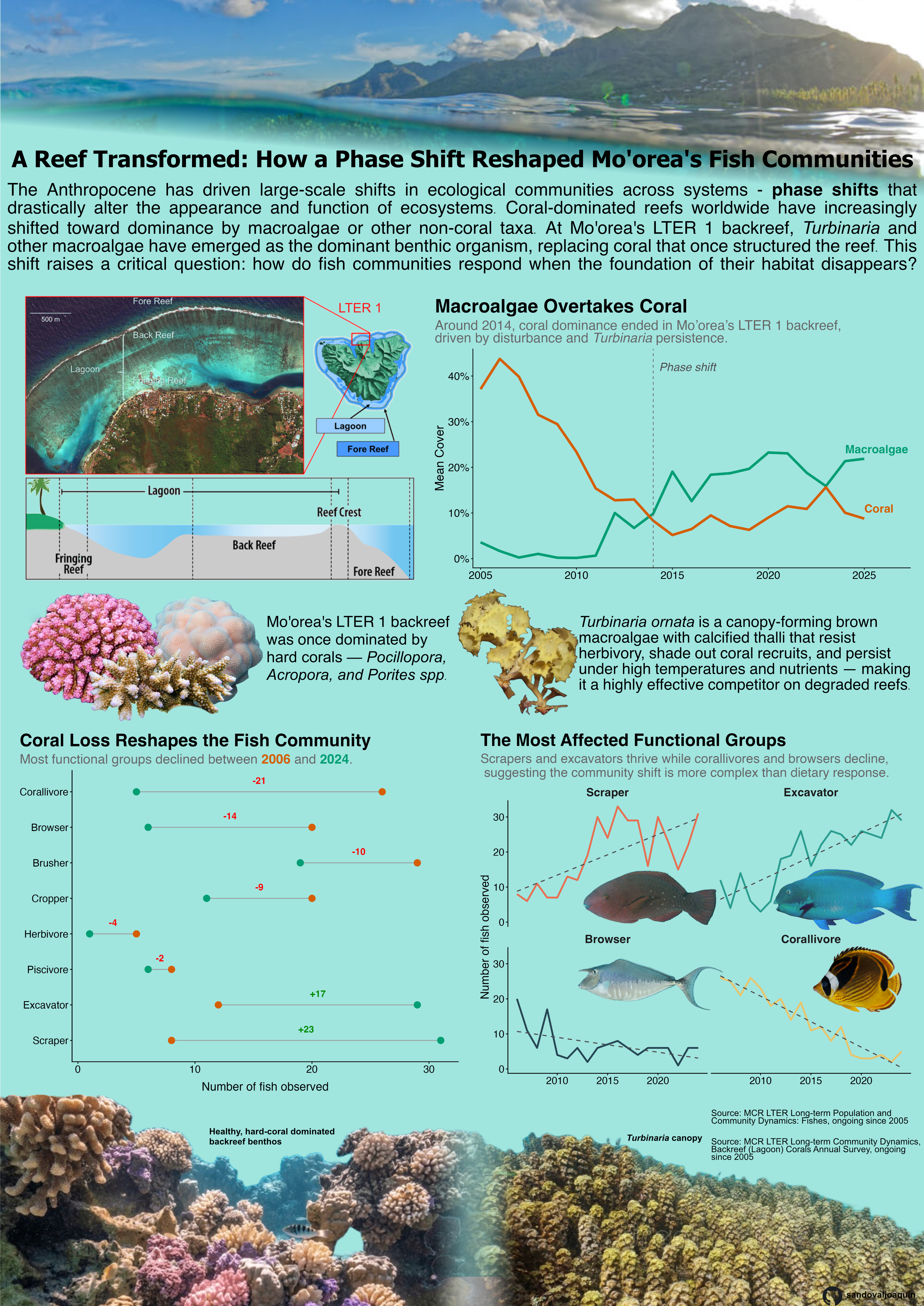
Coral reefs are among the most biodiverse ecosystems on Earth, yet they are disappearing at an unprecedented rate. The Anthropocene has driven large-scale phase shifts on reefs worldwide — transitions from coral-dominated to macroalgae-dominated states that fundamentally alter ecosystem structure and function. At Mo’orea’s LTER 1 backreef in French Polynesia, Turbinaria ornata, a canopy-forming brown macroalgae well-defended against herbivory, has emerged as a dominant benthic organism following decades of disturbance. As coral cover declines, how do fish communities respond when the foundation of their habitat disappears? Using long-term monitoring data from the MCR LTER (Moorea Coral Reef Long Term Ecological Research site, ongoing since 2005), this infographic tracks benthic cover and fish functional group abundance from 2006 to 2024. Together, these data reveal which functional groups thrive and which suffer as Mo’orea’s backreef undergoes a fundamental transformation.
Approach and decisions for 10 design elements
Graphic Form The line plot tracks benthic cover over time, with a phase shift annotation marking the ecological turning point around 2014. The dumbbell plot compares fish functional group abundance between 2006 and 2024 with direction of change. A faceted line plot with trend lines shows each functional group’s trajectory over the full 20-year period. Together, these visuals answer three sequential questions: how did the benthos change → how did fish composition shift → which groups were most affected.
Text Titles: are bolded and tell a story. Subtitles deliver the specific finding. Axis labels use plain language. Captions cite data sources consistently across all three plots.
Themes: theme_classic() was used throughout to minimize non-data ink. Strip backgrounds were softened to grey95. Grid lines were removed entirely. All three plots are consistent in style.
Colors: A colorblind-friendly palette was used throughout (orange/green from the Wong palette). Green consistently represents macroalgae and red/orange consistently represents coral across all plots.
Typography: Plot titles are bold at consistent sizes. Subtitles are grey, signaling to the reader that they should be read after. Annotations use italic text to distinguish them from axis labels. Font sizes are consistent across plots.
General Design: Fish functional groups are ordered by magnitude of change on the dumbbell plot, making the direction of community shift immediately readable. Colored row highlights draw attention to the most and least affected groups — green for Scrapers and Excavators, red for every other group that declined. Omnivores were removed because their high baseline abundance expanded the scale. The faceted time series mirrors this ordering, placing increasing groups on top and declining groups on bottom. Legends were replaced with direct labels where possible to keep data-ink ratio high.
Contextualizing Data: A site map and reef zone diagram orient the reader geographically and ecologically. A Turbinaria ornata specimen photo with description explains the ecological mechanism driving the observed changes. A coral-dominated reef is contrasted with a Turbinaria-dominated reef at the bottom of the infographic. The blog post introduction provides narrative context before the data is presented, framing the ecological question the visuals answer.
Centering Primary Message: Each plot title states the finding rather than just describing the topic, so the reader understands the takeaway before interpreting the data. The infographic title ties all three plots together into a single story. The introduction ends with a teaser that pulls the reader into the data.
Accessibility: The benthic cover plot uses the Wong colorblind-friendly palette. Direct labels replace legends where possible. Font sizes are kept at or above 10pt throughout.
DEI Lens: The location of this data is named accurately throughout. Reef degradation is framed as Anthropocene-driven rather than a natural or neutral process, acknowledging human responsibility. The introduction is written to be accessible to a general audience, not just marine ecologists.
The following code used to make the visuals in the infographic can be accsessed here:
Code
library(tidyverse)
library(ggtext)

fish <- read_csv(here::here("blogposts", "infographic", "data", "MCR_LTER_Annual_Fish_Survey_20250324.csv")) |>
  janitor::clean_names()

backreef <- read_csv(here::here("blogposts", "infographic","data", "MCR_LTER_Coral_Cover_Backreef_Long_20260219.csv"))

# Calculate mean coral cover for transects within LTER 1
coral_cover <- backreef |>
  filter(benthic_category == "coral",
         site == "LTER_1") |>
  group_by(year, site) |>
  summarise(mean_site_coral_cover = mean(percent_cover))

# Calculate mean macroalgae cover for transects within LTER 1
macroalgae_cover <- backreef |>
  filter(benthic_category == "macroalgae",
         site == "LTER_1") |>
  group_by(year, site) |>
  summarise(mean_site_algae_cover = mean(percent_cover))

joined_cover <- left_join(coral_cover, macroalgae_cover) |> pivot_longer(cols = c(mean_site_coral_cover, mean_site_algae_cover),
               names_to = "type",
               values_to = "cover")

# Plot benthos cover graph

benthic_plot <- ggplot(joined_cover, aes(x = year, y = cover, color = type)) +
  geom_line(linewidth = 1.8) +
  geom_vline(xintercept = 2014, linetype = "dashed", color = "grey40", linewidth = 0.5) +
  annotate("text", x = 2014.3, y = 42, label = "Phase shift",
           hjust = 0, color = "grey30", size = 6, fontface = "italic") +
  annotate("text", x = 2024, y = 24, label = "Macroalgae",
           color = "#009E73", hjust = 0, size = 6, fontface = "bold") +
  annotate("text", x = 2025, y = 11, label = "Coral",
           color = "#D55E00", hjust = 0, size = 6, fontface = "bold") +
  scale_color_manual(values = c("mean_site_algae_cover" = "#009E73",
                                "mean_site_coral_cover" = "#D55E00")) +
  scale_y_continuous(labels = scales::label_percent(scale = 1)) +
  scale_x_continuous(expand = expansion(mult = c(0.02, 0.12))) +
  labs(title = "Macroalgae Overtakes Coral",
       subtitle = "Around 2014, coral dominance ended in Mo'orea's LTER 1 backreef,<br> driven by disturbance and *Turbinaria* persistence.",
       x = NULL, y = "Mean Cover", color = NULL) +
  theme_classic() +
  theme(
    plot.title = element_text(face = "bold", size = 28),
    plot.subtitle = element_markdown(size = 20, color = "grey40"),
    plot.title.position = "plot",
    axis.text = element_text(size = 16),
    axis.title = element_text(size = 18),
    legend.position = "none",
    plot.background = element_rect(fill = "transparent", color = NA),
    panel.background = element_rect(fill = "transparent", color = NA)
  )

# Summing observations from 2006
fish_2006 <- fish |>
  group_by(fine_trophic) |>
  filter(fine_trophic != "na",
         year == "2006",
         habitat == "Backreef",
         site == "LTER_1") |>
  summarise(n = n()) |>
  mutate(total_number = n) |>
  arrange(desc(total_number))

# Summing observations from 2024
fish_2024 <- fish |>
  group_by(fine_trophic) |>
  filter(fine_trophic != "na",
         year == "2024",
         habitat == "Backreef",
         site == "LTER_1") |>
  summarise(n = n()) |>
  mutate(total_number = n) |>
  arrange(desc(total_number))

# Prepare start (2006) and end (2024) counts
fish_start <- fish_2006 |>
  rename(start = total_number) |>
  select(fine_trophic, start)

fish_end <- fish_2024 |>
  rename(end = total_number) |>
  select(fine_trophic, end)

# Join and calculate change
dumbbell_data <- fish_start |>
  left_join(fish_end, by = "fine_trophic") |>
  mutate(change = end - start,
         fine_trophic = reorder(fine_trophic, change)) |>
  filter(fine_trophic != "Benthic Invertebrate Consumer")

# Dumbell plot of fish community change

dumbbell_plot <- ggplot(dumbbell_data |>
         filter(fine_trophic != "Omnivore", fine_trophic != "Concealed Cropper"), aes(y = fine_trophic)) +
  geom_segment(aes(x = start, xend = end, yend = fine_trophic), color = "grey60") +
  geom_point(aes(x = start, color = "#D55E00"), size = 4) +
  geom_point(aes(x = end, color = "#009E73"), size = 4) +
  geom_text(aes(x = (start + end) / 2,
                label = ifelse(change > 0, paste0("+", change), as.character(change)),
                color = ifelse(change > 0, "green4", "red")),
            vjust = -1.2, size = 4.5, fontface = "bold") +
  scale_color_identity() +
  scale_y_discrete(labels = c("Herbivore/Detritivore" = "Herbivore"), limits = rev) +
  labs(x = "Number of fish observed",
       y = NULL,
       title = "Coral Loss Reshapes the Fish Community",
       subtitle = "Most functional groups declined between <span style='color:#D55E00'>**2006**</span> and <span style='color:#009E73'>**2024**</span>.") +
  theme_classic() +
  theme(
    legend.position = "none",
    plot.title = element_text(face = "bold", size = 24),
    plot.subtitle = element_markdown(color = "grey40", size = 18),
    axis.text = element_text(size = 14),
    axis.title = element_text(size = 16),
    plot.title.position = "plot",
    plot.background = element_rect(fill = "transparent", color = NA),
    panel.background = element_rect(fill = "transparent", color = NA),
    axis.title.x = element_text(size = 16, margin = margin(t = 10))
  )


# Filter for 4 groups, sum their observations per year in backreef locations
functional_through_years <- fish |>
  group_by(year, fine_trophic) |>
  filter(habitat == "Backreef",
         fine_trophic %in% c("Corallivore", "Brusher", "Scraper", "Excavator")) |>
  summarise(n = n()) |>
  mutate(total_number = n)

# Custom palette for different functional groups
palette <- c("Browser" = "#264653", "Corallivore" = "#E9C46A",
             "Excavator" = "#2A9D8F", "Scraper" = "#E76F51")

functional_groups_plot<- ggplot(functional_through_years,
       aes(x = year, y = total_number, color = fine_trophic)) +
  facet_wrap(~fine_trophic, scales = "fixed") +
  geom_line(linewidth = 1.2) +
  geom_smooth(method = "lm", se = FALSE, linetype = "dashed",
              linewidth = 0.7, color = "grey30") +
  scale_color_manual(values = palette) +
  labs(x = NULL,
       y = "Number of fish observed",
       title = "The Most Affected Functional Groups",
       subtitle = "Scrapers and excavators thrive while corallivores and browsers decline,\n suggesting the community shift is more complex than dietary response.") +
  theme_classic() +
  theme(
    legend.position = "none",
    strip.text = element_text(face = "bold", size = 16),
    strip.background = element_rect(fill = "transparent", color = NA),
    axis.text = element_text(size = 14),
    axis.title = element_text(size = 16),
    plot.title = element_text(face = "bold", size = 24),
    plot.subtitle = element_text(color = "grey40", size = 18),
    plot.caption = element_text(size = 12),
    plot.title.position = "plot",
    panel.grid.minor = element_blank(),
    plot.background = element_rect(fill = "transparent", color = NA),
    panel.background = element_rect(fill = "transparent", color = NA)
  )
Citation
BibTeX citation:
@online{sandoval,
  author = {Sandoval, Joaquin},
  title = {EDS 240 {Infographic}},
  url = {https://sandovaljoaquin.github.io/blogposts/corallivores},
  langid = {en}
}
For attribution, please cite this work as:
Sandoval, Joaquin. n.d. “EDS 240 Infographic.” https://sandovaljoaquin.github.io/blogposts/corallivores.